


An electronic medical record system created by nurses, for nurses.
Redesigning an EMR system specifically tailored for nurses, optimizing its functionality for use on cell phones.
Project Type: End-to-end app design
Role: Product Designer
Industry: Health-tech
Tools: Figma & FigJam
Duration: Q2 2024
The Problem

Electronic Medical Records (EMRs) are essential for delivering quality patient care, but many systems are clunky, hard to navigate, and poorly designed for clinicians’ workflows. This adds to daily stress and contributes to the 33% burnout rate among clinicians. Combined with bulky hardware setups, these challenges highlight the urgent need for a streamlined, mobile-friendly EMR experience—efficient, intuitive, and built for the realities of patient care.
My experiences as a nurse does not represent the experiences of all nurses.
As a nurse, this project deeply resonated with me. My goal was to develop a user-friendly interface while ensuring that I approached the design objectively, minimizing any personal biases.

DISCOVER
Lining up the competitors
I compared the features, strengths, and weaknesses of four EMR systems: eClinicalWorks, Athenahealth, DrChrono, and Cerner Ambulatory. This analysis prepared me for user interviews by providing a clearer frame of reference for the types of solutions our users currently rely on. Additionally, identifying common strengths and weaknesses across competitors helped me pinpoint features to emulate and pitfalls to avoid when designing and refining my product.
Explore the competition
-
• eClinicalWorks: Customizable solutions tailored to healthcare providers.
• Athenahealth: Customizable configurations to meet specific departmental needs.
• Cerner Ambulatory: Customizable dashboards for real-time access.
-
• eClinicalWorks: Vast network effects for interoperability.
• DrChrono: HIPAA-compliant information sharing.
• Cerner Ambulatory: Secure platform for information sharing.
• Athenahealth: Seamless collaboration across care settings through secure exchange.
-
• eClinicalWorks & Athenahealth: Complicated dashboards that reduce productivity.
• DrChrono: Lags and glitches in the system.
• Cerner Ambulatory: Cumbersome processes and unreliable integrations.
-
• DrChrono: Steep learning curve.
• Cerner Ambulatory: High learning curve for onboarding.
-
• eClinicalWorks: Inconsistent customer support responses.
• DrChrono: Inactive customer support during critical moments.
• Athenahealth: Unreliable customer support leading to delays.
User Interviews
I interviewed eight nurses, ranging in age from 24 to 65, with nursing experience spanning from 1 to 37 years.
What I was aiming to gather from these interviews was:
To understand nurses roles and workflows.
Assess the systems usability and functionality.
Identify gaps in functionality.
Evaluate system performance and reliability.
Examine integration and interoperability.
Understand sentiments about security and privacy.

“It would be nice to see what medications need to be given at the top of the screen for an 8hr shift”
Amy

“I think there should be more variety of colors in the MAR. The colors should be based on the type of medication.”
Conner

“Notifications need to be more like, ‘look at this! Look at this!’ more flashy and annoying so you click on it.”
Courtney

“I primarily use the MAR, flowsheet, orders and chart review to see all the things that need to be done.”
Britt
DEFINE
Analyzing User Interviews
Optimization
Nurses want a summarized view of medications, an easy-to-read medication schedule overview, and enhanced notification functionality.
Pain Points
Nurses have expressed concerns about the excessive number of tabs and screens, the absence of notifications, and the lack of clear organization and effective use of color.
Applications
Nurses utilize Epic and other EMR systems for medication administration, charting and documentation, as well as communication.
Functionality
Nurses find the Epic EMR system to be user-friendly and intuitive, facilitating seamless communication with medical staff. They appreciate its speed, responsiveness, and minimal occurrence of unscheduled issues.
What I learned
In the user interviews, I aimed to understand both the current workflows and user sentiment about the existing product. I wanted to uncover pain points like excessive tabs, lack of notifications, and poor organization, while also learning what users appreciate, such as the system’s speed and ease of communication. I chose to conduct interviews because they provide direct, qualitative insights into user experiences, allowing me to better understand how to optimize the system to address their needs and improve usability.
User Personas
Personas help me understand the goals, motivations, needs, and frustrations of our users in relation to the product we’re building. I use them as a foundation during the ideation phase to guide the design process. When asked, I should be able to quickly identify the persona’s problem statement and confidently defend my design decisions by referring to the persona.


Project Goals
To make the best design decisions, it’s important to step back and gain a clear overview of the business, user, and technical goals, while identifying the common ground between them. Aligning user and business goals ensures that design solutions not only meet user needs but also drive business success, creating a balance that benefits both the user experience and the company’s objectives. The commonality that stands out is simplicity. Simplicity benefits both the business and the user by creating a functional, intuitive product that is easy to use and widely adopted, ensuring that it meets the needs of both parties while driving business success.

Insights to HMWs
-
HMW design a mobile EMR system that helps reduce drug errors and iatrogenic injury in the healthcare environment?
-
HMW create a user-friendly interface for mobile EMR systems that simplifies data input and navigation for healthcare professionals?
-
How might we design an EMR system that provides clear and intuitive alerts for new orders, overdue tasks, and medications to support timely and accurate nursing care?
A solution isn’t effective unless it addresses a real user problem. “How Might We” (HMW) questions are designed to help frame these problems in a way that encourages creative thinking and solutions. They serve as an anchor for your personas and kickstart your brainstorming process, guiding you towards impactful, user-centered ideas.
Brainstorming
Using the HMWs, I began brainstorming solutions to spark new and innovative ideas for the problems I’ve identified.
Playing with opposites:
I brainstormed the worst possible solutions and then considered what the opposite of each would be. I flipped the negative ideas into their positive counterparts to uncover potential good solutions.

Bad Ideas
-
Develop an EMR system that lacks safeguards for the 5 Rights of medication administration: right patient, right medication, right dose, right time, and right route.
-
Develop complicated or counterintuitive navigation that slows down workflows
-
Tasks are not aligned with how nurses typically work, such as requiring the medication to be scanned before the patient, which disrupts the natural workflow.
-
Placing alerts in side tabs that are not visually prominent and lacking a way to ensure the nurse has acknowledged the notification can lead to missed critical information.

Good Ideas
-
Have the ability to scan both the patient and medication with a mobile device to ensure the 5 Rights of medication administration are upheld.
-
The interface should include only the essential sections necessary for nurses to perform their duties: MAR, flowsheet, orders, chart review, and labs.
-
Tasks should be aligned with the natural workflow of nurses. For example, scanning the patient first and then the medication would mirror the typical process, reducing disruption and increasing efficiency.
-
Item prominently displayed in a central, easily noticeable area of the interface with clear visual indicators (e.g., color changes, icons, or pop-up notifications). Additionally, there should be a way to confirm that the nurse has acknowledged or acted on the alert, such as requiring a click to mark it as read.
Constraints
An “anything goes” mentality can foster creativity, but studies show that setting constraints actually helps motivate you and can spark even more innovative ideas.
Ideas must be customizable
-
Nurses can personalize their dashboard to show the most relevant information, such as the patient’s medication schedule, recent vitals, or care tasks, making it easy to access the data they need most.
-
Nurses can customize the flowsheet to track specific patient data relevant to their role, such as input/output monitoring, pain scores, or wound care progress.
Single-screen navigation
-
A single screen that displays all key patient information, including vital signs, medication orders, current treatments, lab results, and recent notes, so nurses don’t have to switch between multiple tabs or screens.
-
A screen where nurses can see a complete medication schedule, check-off administered medications, and view important patient data, all on one page, eliminating the need to navigate to separate sections.
Develop
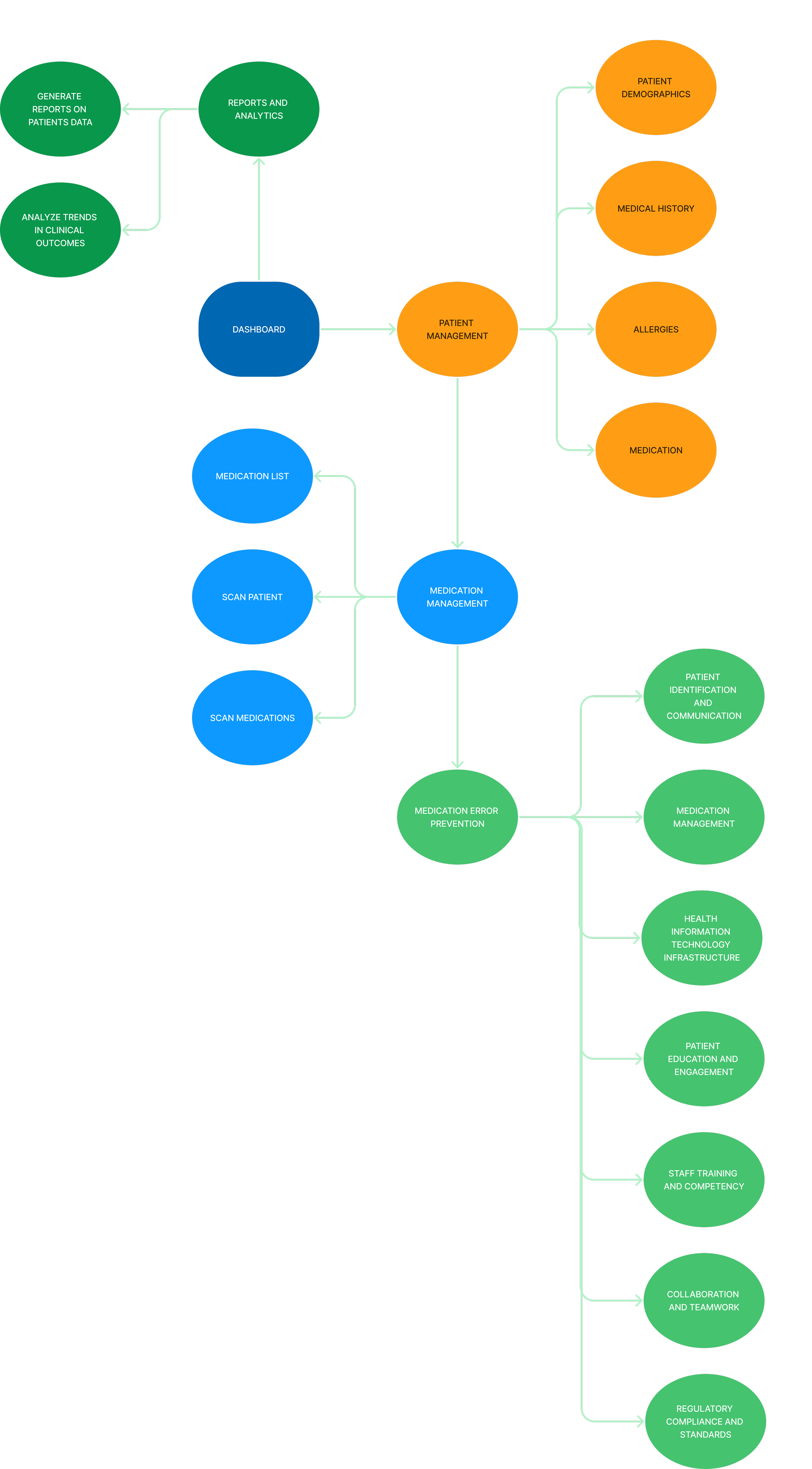
Site map
A sitemap is a visual communication tool that represents the structure and relationships of the pages or screens. It’s an essential tool for organizing and understanding how users navigate through the EMR system.
User flow
For the EMR user flow I wanted to focus on one subtask, from selecting a patient to administering medication, a crucial aspect of patient care that was first addressed in the initial interviews. It begins with the healthcare provider logging in, navigating the patient list to locate the relevant record, and reviewing the patient summary, which includes demographics, vital signs, and current medications. The provider then proceeds to administer medication, supported by the EMR system. This streamlined flow addresses critical tasks and emphasizes error prevention and clear notifications, as highlighted in initial interviews.
I worked out the user flow with these questions in mind
• What information will users be viewing at each step?
• Where are the key decision points for the user?
• What alternate or error paths might users encounter?
• Are all alternate paths essential, or are some avoidable?
• How can we help users prevent or recover from errors?

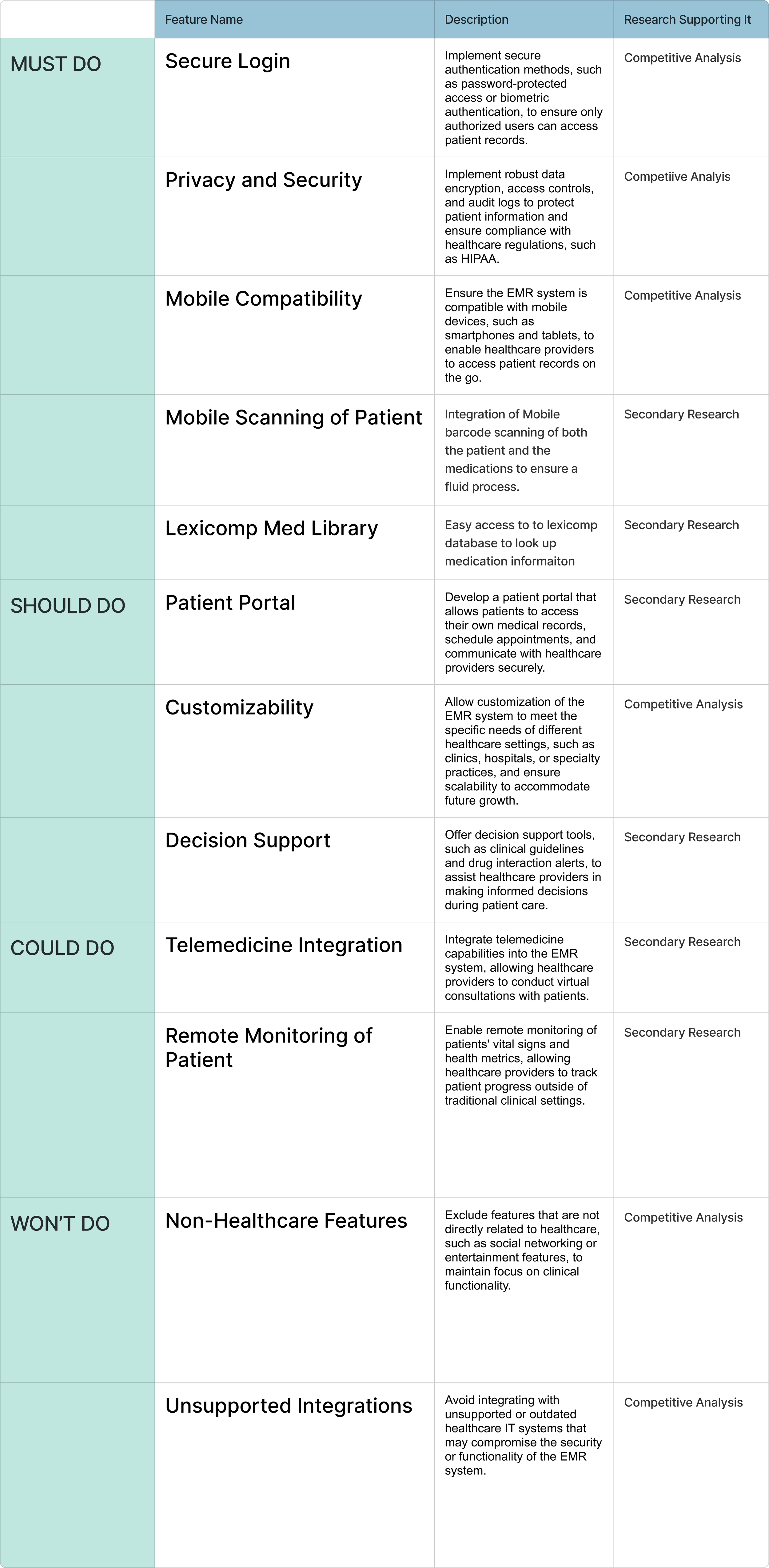
Feature set
The purpose of a feature set is to define the core elements of a product that allow users to accomplish their goals. A feature is something a product has that enables users to take specific actions or achieve certain tasks. Broadly, features can include capabilities, components, user interfaces, and performance aspects. As identified in the Project Goals section, my main focus is on ensuring that each feature contributes meaningfully to the user experience, making it more simplistic, faster, and more intuitive for users to interact with the product.

After evaluating which features are most important, the key factors that stood out are mobile compatibility for both documentation and scanning, as well as a strong focus on security and privacy.
Low-fidelity wireframes
Based on insights from the initial interviews, where participants highlighted how they use the EMR system and the need for streamlined, intuitive flows with minimal screens and tabs, I applied this understanding during the ideation phase. I brainstormed solutions focused on safety, workflow, alerts, and interface design, while considering the project goals and feature sets to identify the most essential elements. From there, I developed wireframes that addressed these key themes, ensuring the system was simplistic, user-friendly, efficient, and aligned with nurses’ daily tasks, all while prioritizing safety and ease of use.


The first wireframe represents the home screen, where the nurse can easily scroll through the essential information needed for patient care. This information was prioritized based on its primary use and importance, as identified in the initial interviews. One feature added later, not shown here, is the ability to horizontally scroll through vital signs, abnormal lab results, and imaging, which helps condense the information. The subsequent wireframes depict the Medication Administration Record (MAR), where a list of medications to be administered is shown. The second-to-last wireframe provides a detailed view of a selected medication. Finally, the last wireframe illustrates an error message that is clear and requires acknowledgment, ensuring that nurses can address the issue promptly.
Mood board
Style tile
Mid-fidelity wireframe
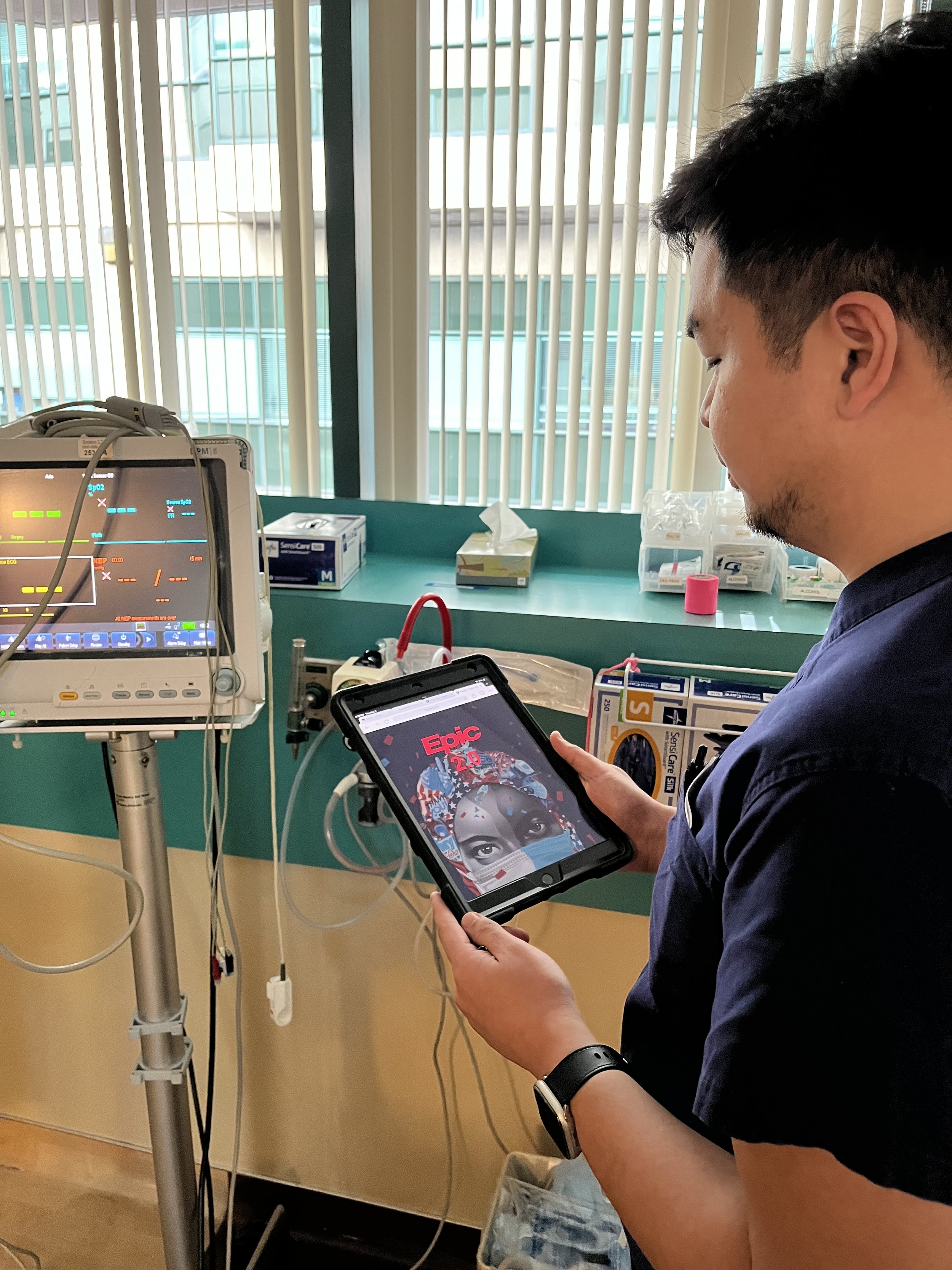
Building on the existing Epic system, I integrated user feedback to address pain points and improve usability. Through brainstorming and ideation, I aimed to enhance the overall user experience by refining the interface to better meet the needs of healthcare professionals. One key challenge was streamlining the system, which currently includes multiple toolbars, a sidebar, and various categories, often overwhelming users. I focused on reorganizing and prioritizing essential information for medication administration to reduce navigation time. This optimization improves workflow efficiency, reduces burnout, and supports better patient outcomes.
User testing
The initial iteration of Epic 2.0 served as a prototype for user testing, allowing participants to interact with the interface to evaluate its functionality, usability, and effectiveness. By incorporating real user feedback and observations, valuable insights were gained for improving and refining the interface. This iterative process ensured that subsequent versions would better align with user needs and expectations.
Task 1:
All users successfully logged into the app from the homepage, indicating a clear and accessible login process that contributed to overall user satisfaction and usability.
Task 2:
Participants successfully selected the requested patient, reflecting positively on the app's design, including the ease of scanning the patient list, intuitive selection process, and responsive interface that met accessibility standards.
Task 3:
Four out of five participants successfully selected the medication icon, suggesting its effective design and placement, though one participant's difficulty highlights the need for further refinement to ensure a consistent user experience.


High-fidelity wireframe
Hero page
Patient list
Patient summary
A streamlined, scrollable task bar gives clinicians quick access to all key actions—medications, labs, imaging, and orders—right at the top of the screen. This helps structure the day, reduce cognitive load, and improve efficiency at a glance.
Centralizing latest vitals, abnormal labs and recent imaging in one accessible scrollable view, saves clinicians from navigating multiple tabs, sifting through 20+ lab results, and scrolling endlessly—streamlining decision-making and care.
Centralizing notes allows clinicians to quickly understand a patient’s journey—from arrival in the ED to admission on the unit—providing a clear, continuous view of their history.
In the current Epic interface, orders live on the left toolbar and are easy to miss. A pop-up notification for new orders, paired with a centralized orders section, ensures clinicians see and act on them promptly.