
Project type: End-to-end app design
Role: Product Designer
Industry: Health & Fitness ‘
Tools: Figma
Duration: Q1 2025
Designed for Connection: Simplifying How Fitness Communities Connect, Communicate, and Grow


The Problem

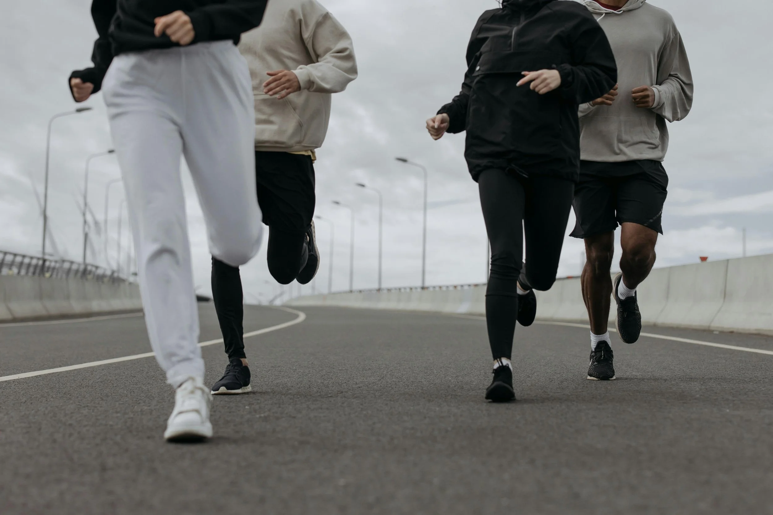
As a member of multiple workout clubs across the city, I noticed a recurring issue: communication is fragmented across several platforms—group chats, email threads, social media, and event apps. This scattered approach leads to missed messages, duplicate conversations, and general disorganization.
This lack of a centralized system not only disrupts planning but also weakens the sense of connection within each club. People join these groups not just to work out, but to find motivation, accountability, and community. When the tools we rely on work against that goal, the entire experience suffers.

My first task was to identify user needs—not just from my own perspective, but by engaging with my peers to gain a broader understanding. Through these conversations, I distilled the insights into four key categories: Pain Points, Functionality, Optimization, and Applications.

Alyssa
“I always feel like I’m missing something—by the time I scroll through all the messages, the important stuff is already buried.”

Pain Points
1. Unorganized Messaging
Reason: Important updates get lost in long, unstructured chat threads, making it difficult for members to find key information amidst casual conversations.
2. Overwhelming Flow of Information
Reason: Multiple topics being discussed in the same chat space causes information to become cluttered, with essential details getting buried in a sea of unrelated messages.
3. Difficulty Finding Information
Reason: In the current setup, important updates and event details are buried within long chat threads, making it time-consuming to locate the right information when needed.
Marcus
“There’s so much random chatter in the main thread that I can never find the actual event details when I need them.”
Optimization
1. Streamlined Communication Flow
Reason: Reducing the noise and clutter in chat threads would allow for more focused, relevant discussions, ensuring that members are not overwhelmed by unnecessary information.
2. User-Friendly Interface
Reason: A simple and intuitive interface would make it easier for both tech-savvy and less experienced users to navigate the app, ensuring broad accessibility.
3. Seamless Integration with Calendar and Maps
Reason: Integrating a calendar feature for event scheduling and route maps would eliminate the need for external tools like Google Sheets and manually coordinating details, streamlining planning and participation.
4. Automated Event Updates and Reminders
Reason: Automated event reminders and updates would reduce the risk of forgetting important details and ensure better member engagement, especially for new or infrequent participants.
Functionality
1. Centralized Event Scheduling
Reason: A unified platform would allow for clear scheduling, reducing confusion and ensuring all members are on the same page regarding when and where runs will take place.
2. Clear Topic Channels
Reason: Structuring channels by specific topics (e.g., weekly runs, training advice, social events) would make it easier for members to find and participate in conversations that are relevant to them.
3. Real-Time Notifications and Reminders
Reason: Automated push notifications or reminders about upcoming runs and events would help ensure no one misses important updates and encourages greater participation.
4. Community Engagement Tools
Reason: Features like polls, discussions, and progress tracking would encourage deeper interaction between members, fostering a sense of community and motivating consistent participation.
Applications
.1. Strava Integration
Reason: Since many members already use Strava for tracking their runs, integrating it into the app would allow users to seamlessly log and share their workouts without having to switch between platforms.
2. Meetup for Event Planning
Reason: The app could integrate features from Meetup for creating and organizing events, making it easier to manage RSVPs and handle different run types (casual, long-distance, etc.).
3. WhatsApp Alternative for Structured Communication
Reason: By moving off WhatsApp, the app can provide a cleaner, more organized communication space that allows for designated areas for various types of content—runs, fitness tips, social events—improving clarity and reducing messaging overload.
4. Google Calendar Sync for Scheduling
Reason: Synchronizing the app with Google Calendar or other scheduling tools would provide seamless event planning and notifications across different platforms, ensuring members don’t miss runs.
5. Community Support Platform
Reason: An in-app social component, like a forum or chat feature, would encourage peer support, motivation, and shared experiences, further strengthening the sense of community.5. Real-Time Feedback and Adaptation
Reason: The ability to gather instant feedback through surveys or in-app reactions would help optimize the app’s features continuously, improving overall satisfaction and engagement over time.

Once the interviews were made into an affinity map I was able to create a problem statement, which clearly defines the core issue or challenge that a product or feature aims to solve and guides the design process.
As many social groups grow in size and engagement, their current communication systems—often spread across platforms like WhatsApp, Meetup, and email—struggle to keep up. Conversations quickly become disorganized, important updates get buried, and members find it difficult to track events, follow relevant topics, or connect meaningfully with others.
This fragmentation makes the community harder to manage and diminishes the overall member experience. Groups need a more centralized, organized, and engaging communication platform—one that supports growth while preserving the authentic, social feel that brought members together in the first place.
From there, I reframed the problem into an opportunity by crafting a ‘How Might We’ question to spark ideation and open up a range of potential solutions.
How might we design a scalable, intuitive platform that preserves the organic community feel of Marina Run Club while making it easier for members to communicate, connect, and stay informed as the club grows?
Understanding your users is essential to creating meaningful design. By developing personas, I can build a clear, research-driven representation of the target audience. In this case, the core users are young tech professionals with disposable income who value maintaining a balance between health, social connection, and personal well-being.


When designing the wireframes for this project, my focus was on ensuring that both messaging and event information were clearly structured and easily accessible. The goal was to minimize friction and maintain a seamless experience, allowing users to communicate and find information without disruption.

Homepage

Directory

Bio

Set-Up

Events

Channel

For inspiration, I looked to companies that successfully convey a sense of intimacy, exclusivity, and subtle allure. My goal was to create a product that feels clean, modern, and desirable—balancing sophistication with emotional appeal. I focused on the design and ethos of Equinox, Barry’s Bootcamp and Peloton.


As the visual design for the MVP took shape, I conducted user testing to ensure the interface was intuitive, accessible, and aligned with user expectations. My goal was to validate the design direction while uncovering any unmet needs or sources of friction in the experience. I led a series of focus groups and guerrilla testing sessions with potential users, which helped surface patterns in feedback. Many users responded positively to the visual clarity but felt overwhelmed by the number of features presented upfront. Based on these insights, I made the decision to scale back and streamline the feature set. This not only improved the overall usability of the app but also allowed me to accommodate technical constraints that may be discovered during development.
When developing the app, I drew inspiration from platforms like Threads by Meta, Nextdoor, Airbnb, Partiful and the organizational clarity of Spotify. I used a minimal color palette to maintain a sleek, moody aesthetic consistent throughout the experience. The scrolling behavior features a glassmorphism effect, giving the feel of interacting with an organic membrane, adding depth and visual appeal. Organization was key, I aimed to create an intuitive, cohesive experience that felt both functional and immersive.


