

A Platform for Like-Minded Fitness Communities to Help Them Communicate and Stay Connected
Project type: End-to-end app design
Role: Product Designer
Industry: Health & Fitness ‘
Tools: Figma
Duration: Q1 2025


The Problem
As a member of multiple workout clubs across the city, I noticed a recurring issue: communication is fragmented across several platforms—group chats, email threads, social media, and event apps. This scattered approach leads to missed messages, duplicate conversations, and general disorganization.
This lack of a centralized system not only disrupts planning but also weakens the sense of connection within each club. People join these groups not just to work out, but to find motivation, accountability, and community. When the tools we rely on work against that goal, the entire experience suffers.

My first task was to identify user needs—not just from my own perspective, but by engaging with my peers to gain a broader understanding. Through these conversations, I distilled the insights into four key categories: Pain Points, Functionality, Optimization, and Applications.

Once the interviews were made into an affinity map I was able to create a problem statement, which clearly defines the core issue or challenge that a product or feature aims to solve and guides the design process.
From there, I reframed the problem into an opportunity by crafting a ‘How Might We’ question to spark ideation and open up a range of potential solutions.
As many social groups grow in size and engagement, their current communication systems—often spread across platforms like WhatsApp, Meetup, and email—struggle to keep up. Conversations quickly become disorganized, important updates get buried, and members find it difficult to track events, follow relevant topics, or connect meaningfully with others.
This fragmentation makes the community harder to manage and diminishes the overall member experience. Groups need a more centralized, organized, and engaging communication platform—one that supports growth while preserving the authentic, social feel that brought members together in the first place.
How might we design a scalable, intuitive platform that preserves the organic community feel of Marina Run Club while making it easier for members to communicate, connect, and stay informed as the club grows?
It’s important to know who you’re designing for. With the use of Personas I’m able to have a clear, research-based representation of your target users
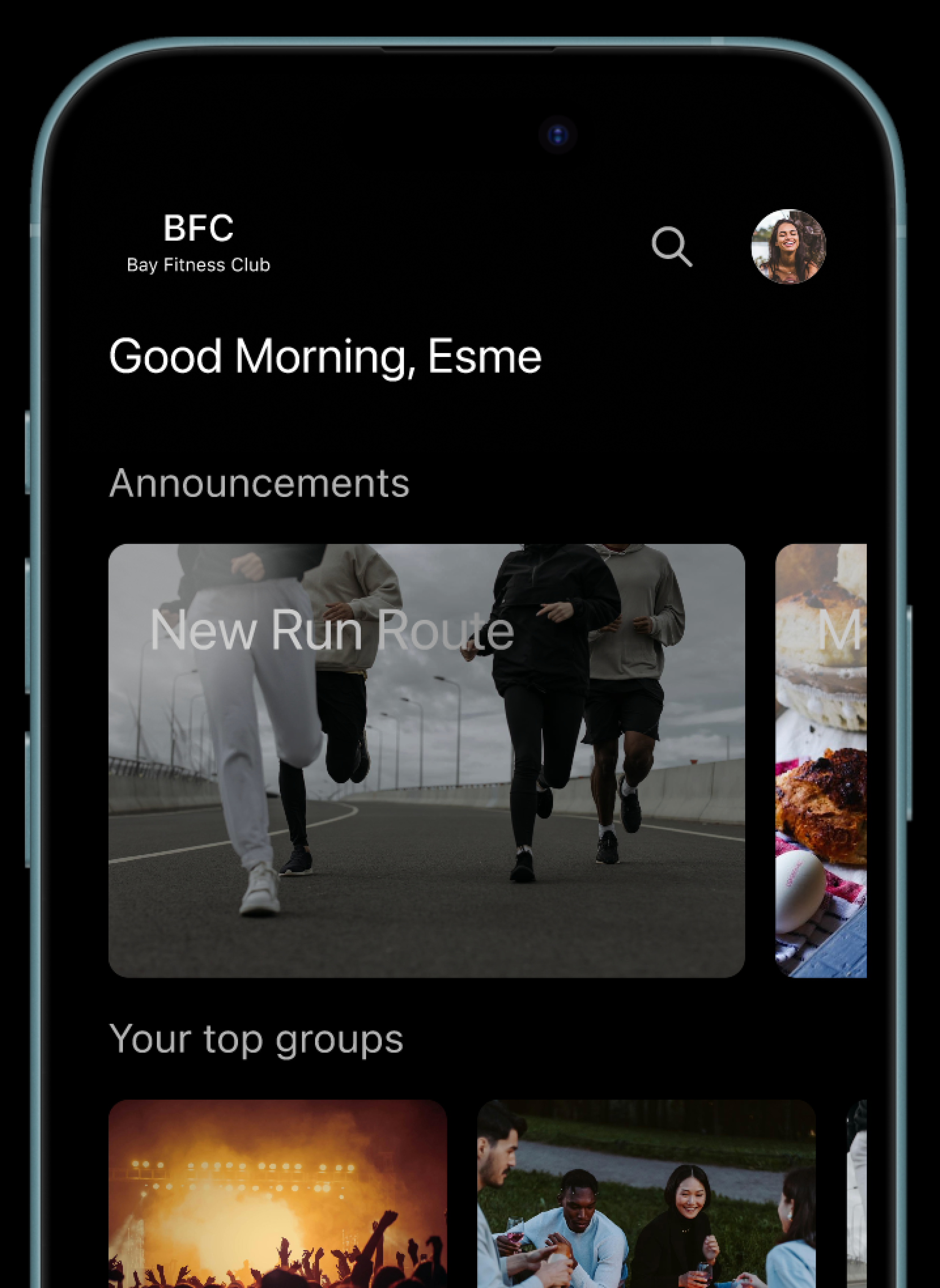
When designing the wireframes for this project, my focus was on ensuring that both messaging and event information were clearly structured and easily accessible. The goal was to minimize friction and maintain a seamless experience, allowing users to communicate and find information without disruption.
Homepage
Set-Up


Directory
Events


Bio
Channel


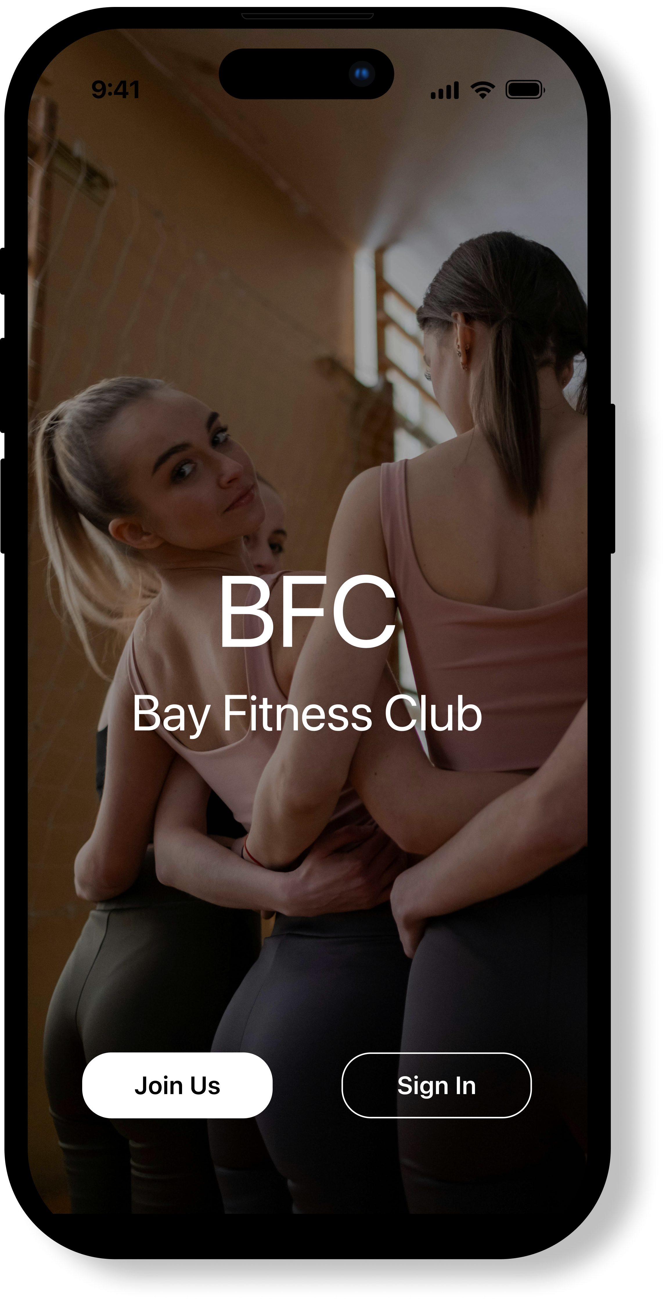
For inspiration, I looked to companies that successfully convey a sense of intimacy, exclusivity, and subtle allure. My goal was to create a product that feels clean, modern, and desirable—balancing sophistication with emotional appeal. I focused on the design and ethos of Equinox, Barry’s Bootcamp and Peloton.


As the visual design for the MVP took shape, I conducted user testing to ensure the interface was intuitive, accessible, and aligned with user expectations. My goal was to validate the design direction while uncovering any unmet needs or sources of friction in the experience. I led a series of focus groups and guerrilla testing sessions with potential users, which helped surface patterns in feedback. Many users responded positively to the visual clarity but felt overwhelmed by the number of features presented upfront. Based on these insights, I made the decision to scale back and streamline the feature set. This not only improved the overall usability of the app but also allowed me to accommodate technical constraints that may be discovered during development.
